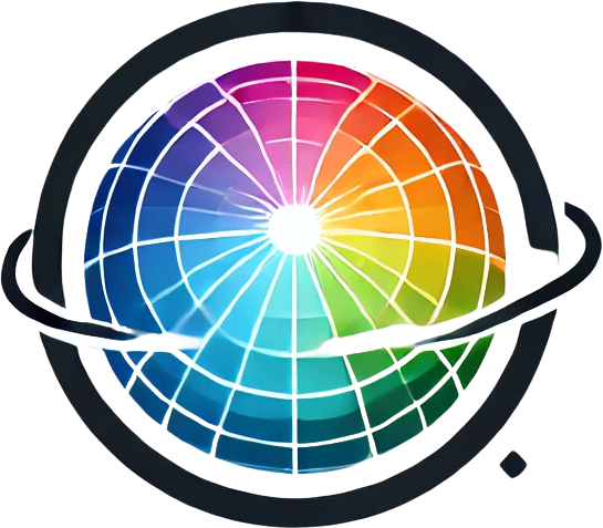

Itten's Colour Theory
Johannes Itten, an influential Swiss painter, designer and teacher, developed groundbreaking insights into colour theory that form the basis of much contemporary colour study in art and design. His work, best known through "Kunst der Farbe" (The Art of Color), offers an in-depth analysis of colour harmony, contrast and the psychological effects of colour. Itten's theories are still of great value in the professional art and design world.
Introduction
Johannes Itten, an influential Swiss painter, designer and teacher, developed groundbreaking insights into colour theory that form the basis of much contemporary colour study in art and design. His work, best known through “Kunst der Farbe” (The Art of Color), offers an in-depth analysis of colour harmony, contrast and the psychological effects of colour. Itten's theories are still of great value in the professional art and design world.
Itten's Colour Circle
Itten's colour circle is based on the three primary colours: red, yellow and blue. These primary colours cannot be obtained by mixing other colours and serve as the foundation for the creation of secondary and tertiary colours:
- Secondary colours: Formed by mixing two primary colours (e.g. red and yellow make orange, yellow and blue make green, blue and red make purple).
- Tertiary colours: Created by mixing a primary colour with an adjacent secondary colour, such as red-orange or blue-green.
Colour Contrasts
Itten introduced several types of colour contrast, which are crucial in art and design:
- Contrast of hue: The use of pure colours next to each other, such as red next to blue.
- Light-dark contrast: The difference between light and dark colours, such as yellow against black.
- Cold-warm contrast: The contrast between cold colours (such as blue) and warm colours (such as red).
- Complementary contrast: Colours positioned opposite each other on the colour circle, such as red and green, reinforce one another when placed side by side.
- Simultaneous contrast: The phenomenon whereby the perception of a colour is influenced by the surrounding colours.
- Contrast of quality: The difference between pure, vivid colours and dull, muted colours.
- Contrast of extension: The difference in the amount of two or more colours used in a composition.
The full article is available to members
You are reading the opening section. Members read the full article.
The full article is available to members
This entry continues with the measurement protocol, worked examples and the source list. Members read it in full.