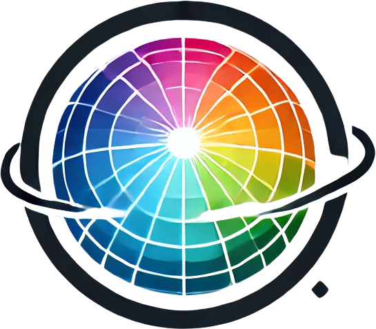

Colour Contrast and Complementarity
Introduction Colour contrast is a fundamental concept in art, design, and visual communication. It refers to the way colours influence each other when placed next to one another. The correct use of colour contrast can improve the readability of a design, capture the viewer's attention, and enhance the overall aesthetic appeal. There are several types of colour contrast, each with unique characteristics and applications. Let's take a closer look at the main types of colour contrast and their effects on visual perception. 1. Light/Dark Contrast Light/dark contrast refers to the difference in lightness between two colours. This type of contrast is crucial for creating visual hierarchy and focus in a design. It can create dramatic effects and is often the most striking contrast in a composition. Application: Light/dark contrast is often used in typography to improve readability, especially when placing…
Introduction
Colour contrast is a fundamental concept in art, design, and visual communication. It refers to the way colours influence each other when placed next to one another. The correct use of colour contrast can improve the readability of a design, capture the viewer's attention, and enhance the overall aesthetic appeal. There are several types of colour contrast, each with unique characteristics and applications. Let's take a closer look at the main types of colour contrast and their effects on visual perception.
1. Light/Dark Contrast
Light/dark contrast refers to the difference in lightness between two colours. This type of contrast is crucial for creating visual hierarchy and focus in a design. It can create dramatic effects and is often the most striking contrast in a composition.
- Application: Light/dark contrast is often used in typography to improve readability, especially when placing text on a coloured background. The difference between black and white is the most extreme example of this type of contrast.
- Effect: This contrast attracts attention and can give a design a sense of depth and three-dimensionality. It is also often used in photography to emphasise shadows and highlights.
2. Warm/Cool Contrast
Warm/cool contrast refers to the difference between warm colours (such as red, orange, yellow) and cool colours (such as blue, green, violet). Warm colours tend to come forward and attract attention, while cool colours appear to recede.
- Application: This contrast is often used to create emotional or psychological effects in art and design. Warm colours, for example, can be used to evoke energy and excitement, while cool colours convey calm and tranquillity.
- Effect: Warm/cool contrast can influence the perception of space and depth in a composition. In interior design, for example, this contrast can be used to make a room appear larger or smaller, depending on the desired atmosphere.
The full article is available to members
You are reading the opening section. Members read the full article.
The full article is available to members
This entry continues with the measurement protocol, worked examples and the source list. Members read it in full.